Digital patients are changing the pharma industry. The pandemic has made us use digital tools offered by the medical and pharmaceutical industries much more frequently. We decided to check how user-friendly are the solutions provided for adverse drug effects reporting?
Teleprescriptions and e-prescriptions have become an everyday reality for patients in many countries. At the same time, our expectations of the digital experience offered by such tools are clearly rising. We expect the experience to be easy, seamless, and enjoyable, just like almost any other digital journey through services and products, i.e. online stores or banking services. The healthcare sector is extremely challenging for digital patients. Many parts of its ecosystem still use outdated, often offline processes and tools that are chaotic and difficult to use.
When designing digital solutions for the Healthcare & Pharma industry, we see an ever-growing awareness of the changing needs and expectations of patients. The willingness to meet expectations is clearly evident in pharmaceutical companies. Many are aware (especially in the current pandemic environment) of patients’ growing needs for transparency in communicating their business and offering increasingly interactive forms of patient contact.
Due to their scale, business, and drug distribution profile, as well as the regulatory environment, pharmaceutical companies have limited options for contacting their direct customers. The easiest way to reach patients is through company websites. They can serve multiple functions, ranging from basic image and information purposes to engaging audiences in specific interactions. An interesting example of a function through which patients can interact with a pharmaceutical company is the adverse drug reaction reporting procedure.
How to build online relationships with patients?
The reporting and monitoring of adverse drug effects is a legally mandated procedure. Doctors, healthcare professionals, and pharmaceutical companies are obliged to report and monitor any adverse drug reactions that patients report to them. This procedure has a very important social role hence should be really well designed.

It allows to collect more information about the safety of pharmaceutical products and update data about them, protecting future patients. Providing a friendly way for patients to report adverse reactions directly allows not only for effective monitoring of drug effects, but can also have an impact on building positive relationships with patients and the perception of industry in general.
There have been many positive changes in the approach of pharmaceutical companies to the procedure of reporting side effects recently. Importantly, the vast majority of pharmaceutical companies are replacing contact with patients via mailbox or paper notification in the form of a PDF file with forms available fully online.
This situation is somehow similar to the process of returning products bought at online stores. Recall the last time you returned an item and your frustration if you had to search for a long time and print out a return form. Online stores that offer a friendly, transparent online return process are much more likely to be appreciated by customers. Interestingly, as our usability studies confirm, the ease of the online return procedure has little impact on the overall frequency of returns, as some companies might fear.
In a world in which we operate increasingly digitally, it is worth taking care of the positive customer experience in every possible interaction with the company. Especially if, as in the case of pharmaceutical companies, opportunities for direct contact with customers are few.
Different approaches of pharmaceutical companies to collecting information on side effects of drugs
Pharmaceutical companies use various forms of online tools to collect information about drug side effects. Some of them take an individual approach to patients by offering simple contact forms on country versions of their websites. The legal framework and the practice of reporting adverse drug reactions in a given country are also important in this aspect. However, what is universal for these tools is a simple, less structured form, allowing for a free, open description of the situation related to the medication problem. This approach gives great freedom to the user. On the other hand, it requires the company to spend more time analysing the patient’s situation and often reconnecting with them.
What distinguishes this approach is primarily the ease of finding the form on the company’s website. It is usually available under a separate link in the footer of the company’s website or in the “Contact” tab, often as part of the form for other issues of contacting the company. Such solutions can be found on the websites of companies such as Boehringer Ingelheim and Merck KGaA.
When analysing this type of forms, it is worth noting that companies take care to transparently inform the patient about the processing of personal data and encourage direct e-mail contact with the company (practice applied by GSK) or provide links to national sites where side effects can also be reported (i.e. Servier).
The second approach most often used by companies operating globally in many markets is to offer a sophisticated tool on the website for reporting side effects of manufactured drugs. These are elaborate forms that allow patients (or healthcare professionals) to share their experiences using a particular manufacturer’s drugs.
What draws attention to this type of tools is the adoption of different levels of detail regarding the data available in the form. This aspect clearly affects the length of time spent filling out such a form. Forms of companies such as Astra Zeneca, USB, Novartis give a more detailed picture of the situation of the patient and the drug used, which is very important from the point of view of monitoring the side effects of the drug. On the other hand, more flexible and shorter forms of companies like Roche, Novo Nordisk, Bayer are friendlier to the user who may not be ready to provide very detailed data.
Both approaches have their advantages and disadvantages. Simple forms give the user a lot of freedom in describing the situation related to the drug, which many patients will appreciate. On the other hand, however, as usability studies show, these types of forms are less likely to be filled out due to users’ concern about the effectiveness of getting the information to the company to quickly address the issue. A descriptive, simple contact form will also be less convenient to fill out using mobile phone. It is worth emphasising that it is the mobile context that plays an increasingly important role in building such tools. The ability to describe an adverse drug event that occurs should be available at any time and in any place.
The advantage of expanded forms is undoubtedly the comprehensiveness of the approach and automation of the data collection process. This builds a positive impression in the eyes of patients while facilitating the way the company collects and analyses the information it receives. However, overly complex forms may discourage users due to the need to spend too much time on them. They often require much more details touching on sensitive and personal data.
It is difficult to identify a one-size-fits-all approach to building drug reporting forms. The choice of approach often depends on the internal goals, organisational structure, and markets in which a pharmaceutical company operates.
Best practices for designing side effect forms
While each industry has its own unique characteristics and design challenges, in general, online form designs have some consistent, universal patterns that are worth following.
When designing a drug side effect reporting form, as in any digital tool design, it is worth thinking well about both the structure and form of the tool, the content layout, the navigation elements, and the graphical aspect. When building a form, it is additionally important to use appropriate (contextually appropriate and useful) field types and types for questions and, above all, to arouse the user’s interest in completing the form to the end.
Below you will find a collection of best practices for form design for reporting side effects. We’ve compiled them based on our experience designing and testing forms across multiple industries (including banking, logistics, and healthcare). The practices were also based on a basic analysis of tools used by major European pharmaceutical companies on their own websites. The practices were divided into key elements of form design, i.e. the general structure and layout of the content, types of questions and fields, elements affecting the ease of filling in the form, building trust among users and mobile context.
25 best practices for drug side effect reporting forms
Overall form design and structure
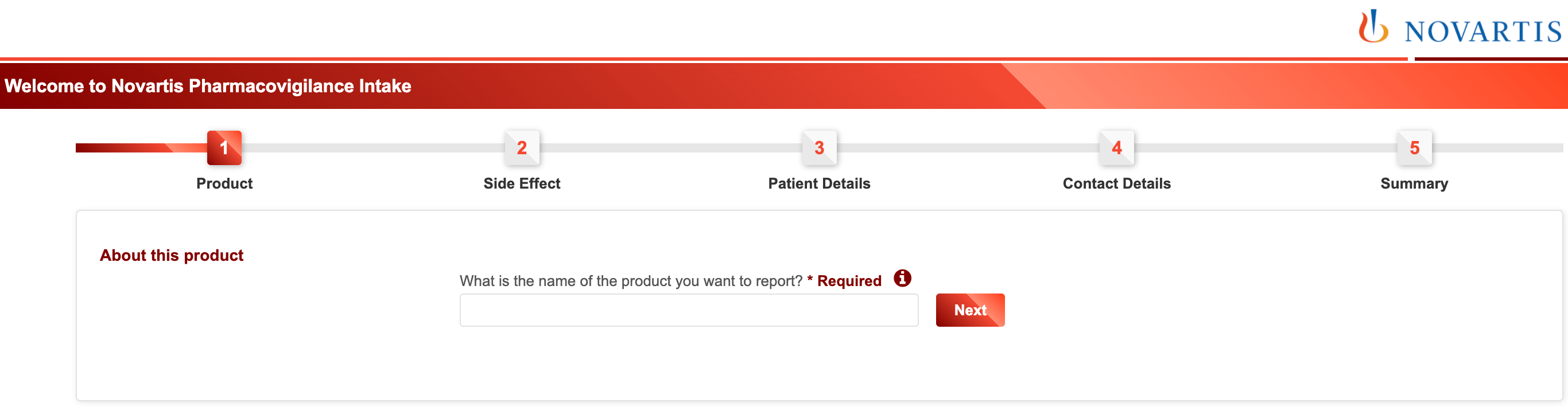
1. Multi-step forms are better than single-step forms
Splitting a form into two or three steps almost always increases completion.
2. Group related fields into sections or steps
If a form has more than six fields (questions) next to each other it is good practice to group them into logical sections (steps).
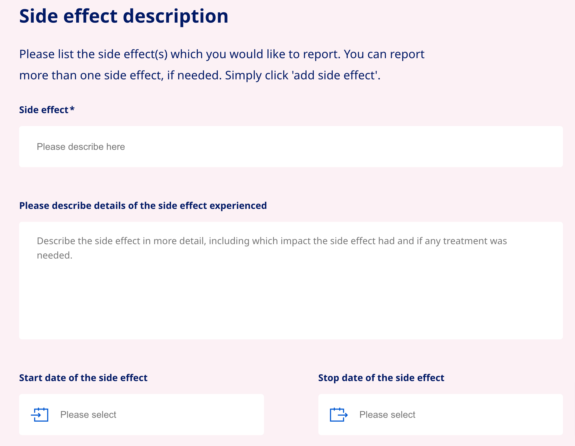
3. Avoid placing questions side by side (in two columns)
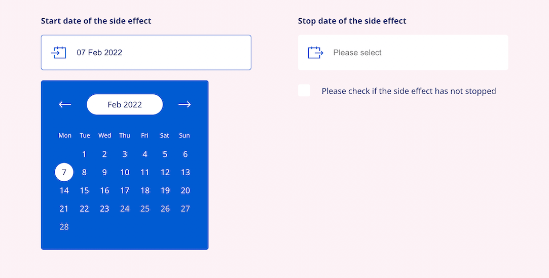
Simple single-column layouts are more convenient than multi-column layouts with questions placed side by side. The exception is dates (day, month, year) or time (hours and minutes), whose fields should be on a single line.
4. Use conditional logic
Display questions only if the user answered the previous question in a certain way. This technique reduces the average length of the form and decreases the likelihood that a bored user, who will not be affected by a significant portion of the questions, will abandon the form.

5. Field labels aligned to the top left corner are best for readability and completion of the form
Placing labels over form fields on the left requires less “visual fixation” by the user. He then naturally scans the field label with his eyes and starts typing text from left to right.
Questions and form field types
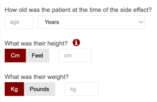
6. Choose field types that reduce the number of clicks required to complete. Radio buttons can be used when there are several options and only one can be selected. Checkboxes work best when more than one option can be selected.
Where possible, use checkboxes and option buttons instead of drop-down lists because they require less cognitive load and user focus.
7. Use smart presets (i.e. country, phone number extension). Suggest to the user (based on IP or geolocation) default field extensions wherever possible. This clearly reduces the time it takes to fill out data and ensures consistency in data collection.
8. Don’t cut fields when asking for a date, phone number or other numeric parameters. Users don’t like chopped fields. They force them to make extra clicks unnecessarily and increase the time it takes to fill out the form. It is a good idea to use consistent one-formatting for these types of form fields.
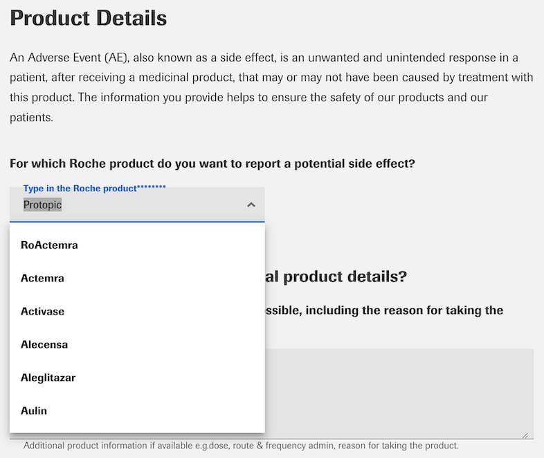
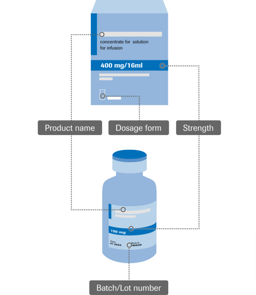
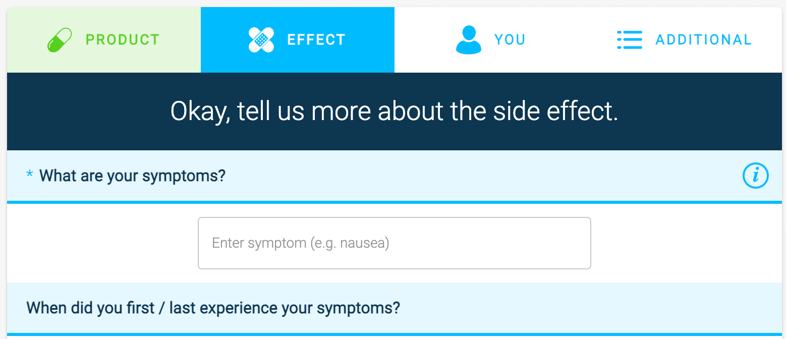
9. Use predictive search for fields with multiple predefined options (e.g., drug name, type of side effect, etc.). Correctly typing a drug name or formulating a side effect description for many patients can be a big barrier to completing the form. Make it easy for them by providing enough predefined options, reducing the amount of text they have to type themselves.
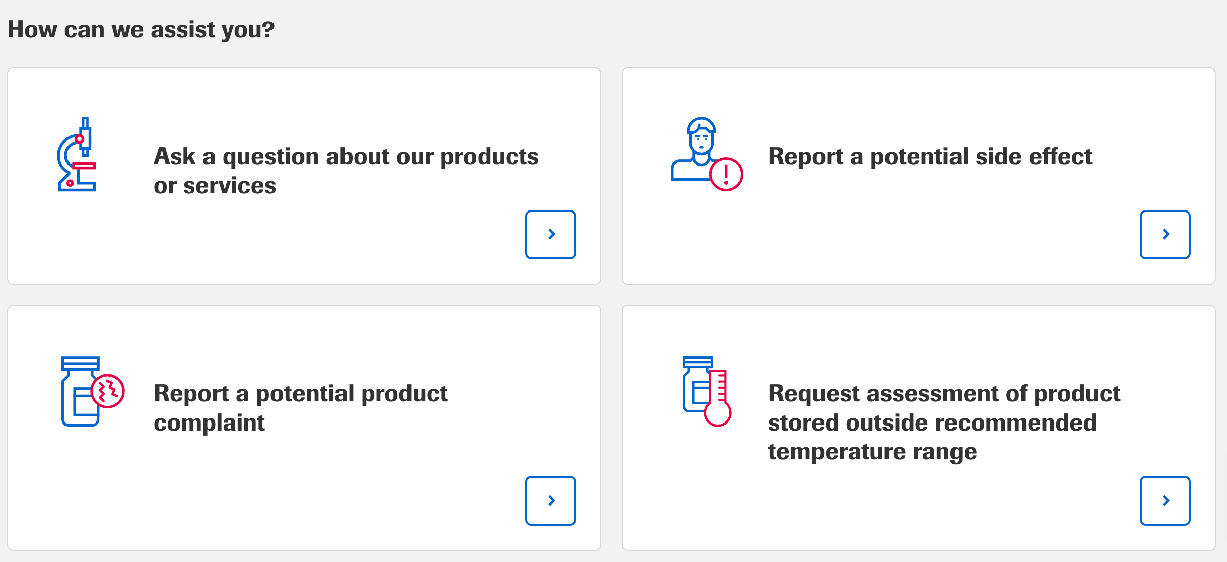
10. Clickable images are among the most engaging questions. Use clickable images wherever it makes sense. This is a very effective method of supporting the user in quickly understanding questions and answers.
Accessibility and ease of use
11. Make sure the entire form is navigable using the tab key
Many people use this method of moving between fields when filling out a form on a computer. At the same time, using this practice is disability friendly and in line with WCAG recommendations.
12. Support the user with hints on difficult questions
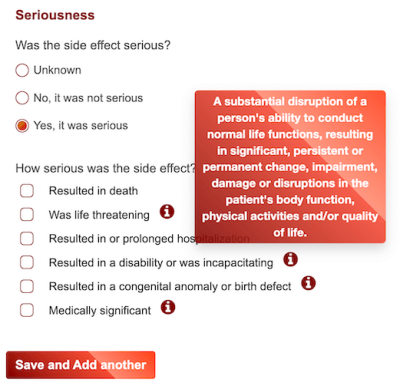
Describing medication side effects is not easy. It requires the user to understand and often to use sophisticated terminology. Help the user by using text or visual cues available at the questions.
13. Use visual clues and icons to make form fields more intuitive
The use of graphics and icons in the form greatly helps the user find their way around in the context of filling out the form. Use simplification in the form of icons or graphics where possible.
14. Avoid overly strict validation when filling in fields
Too strict validation of responses will discourage users from completing the form. Keep the fields open and flexible. Even more so if the topic concerns such sensitive issues as side effect reporting.
15. Precisely illustrate the progress of the form
Progress bars reduce user anxiety while completing the form and encourage completion. Progress bars with graphic or animated elements are most effective.
Build trust
16. Say hello to the user (give context to the form completion and the role they are playing). The first contact is crucial. Make sure to build a friendly atmosphere and explain in simple words the purpose for which you are asking the user to fill out the form. A friendly introduction often influences the successful completion of the form.
17. Provide a clear and attractive graphic design of the form. Users trust forms that are visually appealing. Clarity and consistency of the form’s graphics are more likely to encourage them to fill it out than raw, gray fields placed without a graphical context.
18. Watch the speed of transitions between form pages. Transitions between form pages cannot be too fast or they become unreliable. The user may get the impression that the information they entered did not save.
19. Use contrasting CTA buttons that call to action. Action buttons should stand out from the form. Their color is not unimportant, but the most important thing is the contrast to the whole graphic design of the whole form.
21. Thank the user for completing the form. Build a positive relationship with the user. Give a more human context to form filling.

Optimisation for mobile use
22. Use native features of the mobile device (i.e. camera, geolocation). Enjoy the benefits of filling out the form in mobile form. Additional smartphone features can make filling out a form much easier and faster. You can offer to scan the user’s drug name with the phone’s camera and retrieve their basic contact information automatically based on geolocation.
23. Use specific HTML input to display the correct keyboard (entering text, dates, numbers). A great help in filling out forms on a smartphone is the ability for the user to use predefined keyboards (text, date, special characters). Make sure the keyboards match the question types to speed up the form filling.
24. Fields and buttons should be at least 48 pixels high. Make sure form fields are easily clickable. They should be 48 pixels in size, i.e., about 10 mm. This is the size of an average adult fingertip.
25. Form labels and fonts should be at least 16 pixels. Considering the fact that the form is likely to be filled out by elderly people, the texts placed in it should have at least 16 pixels.

Challenges in building positive customer experiences in the digital world
Following the above rules when designing side effect forms can support the building of positive relationships between pharmaceutical companies and patients.
However, these forms are just one of many elements that make up the entire digital patient journey with a pharmaceutical company.
Even the best-designed form won’t do its job if it doesn’t fit into the entire context of the digital experience offered by a given company. Therefore, essential to building long-term customer relationships is a thoughtful strategy that shapes the patient journey based on the patient’s needs and the company’s individual goals and challenges.
Thinking ahead about the broader digital patient journey strategy is crucial, especially in the face of rising customer expectations. It’s worth thinking about this process comprehensively by taking special care to be consistent in offering the digital experience across different channels of contact (from a website, social media to more advanced tools and specialised mobile apps).
Pharmaceutical companies are becoming increasingly digital. They offer (often in cooperation with medical companies) more and more innovative digital solutions, e.g. applications monitoring patients’ health conditions or different ways to purchase and deliver drugs online. Designing such solutions is not easy, mainly due to the different needs and expectations of particular patient groups. It is gratifying that the Health & Pharma sector is aware of this and is becoming more and more conscious about designing digital products based on proven practices and patterns of customer and user experience.