Health, next to family and security, is one of the essential values in our lives. Designing solutions for the medical industry is a challenging process that requires a lot of knowledge and sensitivity. A particular case is the design of medical reports, which present research results that are often difficult to accept for the patient. How to design medical reports then and make them accessible for non-experts?
When designing medical reports, on the one hand, the medical perspective must be taken into account – the report must contain all the relevant information and analyses that the doctor needs. But, on the other hand, the results should be shown in a way that is understandable and transparent for the patient. Why?
- Often the patient waiting for the results is accompanied by emotional tension. In such circumstances, it isn’t easy to think analytically, understand complex content and search for additional data.
- Medical reports are not always communicated in the doctor’s presence, so sometimes the patient does not have the opportunity to ask additional questions instantly, and the report itself has to address most critical issues and questions that may arise.

- In addition, test results are not just for one specialist – it is often necessary to consult another centre, whose staff do not have access to the entire medical history, but only to selected reports.
Medical reports are thus a significant channel of communication with the patient but also an essential tool for different healthcare professionals (HCP). So how to meet the needs of both these groups?
Determine who the recipient is – medical jargon vs. “human” language
The use of appropriate language in a report is essential, as the perception of the result depends on it. Let’s take a simple morphology example. For a layman, the test results will usually be a set of enigmatic values, the meaning of which must be confirmed with a specialist.
When designing reports from complex clinical trials or DNA tests that help, for example, to determine the probability of contracting a severe disease, one must bear in mind who will be the first to receive them. Unfortunately, it often takes a medical degree to understand what such a document is about. However, some facilities offer separate reports for patients and doctors.
If the recipient of the report is a so-called layman (in this case, a person without medical education), you need to make the information easy to read:
- Do not show what is irrelevant to the patient, e.g., details of previous phases of clinical trials. From the recipient’s perspective, this information may be irrelevant and will introduce a lot of uncertainty.
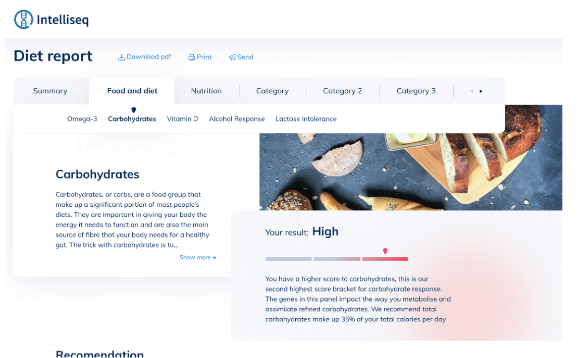
- Highlight important information and put it in context. For example, a statement that erythrocytes are 4.26 million will not tell the patient anything. Still, while highlighting the correct range, a graphical presentation already gives him a reference point when interpreting the result.
- Try to explain what the various words mean that the recipient must understand the result obtained. Sometimes it is needed to explain basic concepts. In the example above, this would be to describe what erythrocytes are. In another type of report, what DNA is.
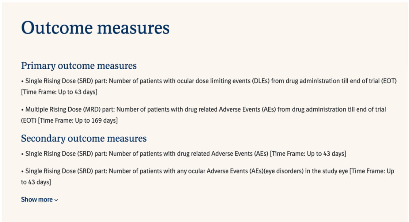
The situation is different with reports for specialists. If the report recipient is a doctor, there is no need to explain every concept, give the range of the standard. Our research shows that this type of additional information is not perceived well by doctors. Instead, additional specialist information may be necessary, e.g., outcome measures in clinical trials or contact to the pharmaceutical company. The time it takes to get to know the data is of great importance – research what is most important to this group, which will make it easier or faster to work with the results and design the report based on this.

The most complex and probably most common type of report is both patients and doctors need to use. Here, proceed carefully to balance the amount of information – include everything relevant to the professional, while maintaining a balance between medical and colloquial language. Also, think about the order of information in the report and which part will be relevant to both groups. For example, clinical trial exclusion criteria may be helpful to the physician and the patient, but the NCT number is not.
Give the result at once, without scrolling
Regardless of the form of the report – an interactive page presenting more lifestyle information or a classic PDF with clinical trial results – it is worth taking care of the first impression and clarity of communication. The result is the most important for both the patient and the doctor – it should be highlighted and immediately visible.

Personalisation will also be important for the patient, which in practice means answering what this result means for them. For example, they have about an 80% chance of being cured if they participate in a clinical trial, or their risk of developing diabetes is about 10%. Of course, conclusions are not always this accurate, so it is worth thinking about how accurate the result is and will be of value to the patient.
Consider the conditions under which the patient views the report
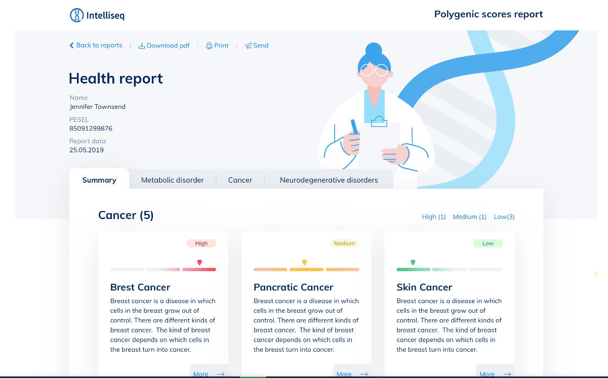
Consider the conditions under which the patient reads the report. This is particularly important when communicating pessimistic information, for example, if the result shows that the patient has a high chance of developing cancer. In this situation, two types of communication can be designed:
The first set of content where the message is published online, and the patient reads it on their laptop, at home, and then has to search for the answers to their questions themselves, a second set of content to be delivered in a medical centre where a doctor will be on hand to talk to the patient and clear up any doubts.
Match the visual layer to the content of the report
The visual layer is critical, although often underestimated. The images and graphics used will have a significant impact on the perception of the report. Therefore, it is essential to consider whether large, colourful images are appropriate when reading information about, for example, the likelihood of suffering from Alzheimer’s disease.
When thinking about form and consider a few things:
- Graphics can have a calming effect when communicating complex information. But the line between something that helps you absorb the message and an overly cartoonish and entertaining form, changing the whole tone of the report to a more lifestyle one, is very fine. Nevertheless, it’s a difficult task, and it’s worth relying on designers who are experienced in this type of task to avoid offending patients.
- The visual part must consider the target market for which the report is being designed. It may be obvious, but the same images will affect an audience in the US differently than an audience in Japan. Analyse whether you will have the time and resources to tailor your images for each market or whether it may be better to use other visual solutions.

- Just because doctors need a lot of information in their reports doesn’t mean they can only rely on tables and compacted blocks of text. Our conversations with specialists show that although they are accustomed to this form, they appreciate any solution that makes it easier to read and analyse the data.
How to design medical reports – summary
I have presented only some of the elements worth paying attention to when working on medical reports in this article. The topic is vast, so I especially urge you to do some research with your potential audience. Each branch of the medical industry in which patients receive research results has its own specific needs, which you need to hear about at the source.
When working on these types of products, it is vital to work with a UI designer because the report’s final, graphically designed form is essential in its reception – including the user’s experience, their experience of receiving the information, and their subsequent associations with the medical centre. The iterative approach, where each successive report version is subjected to usability testing, will definitely help.


